
Home Equity Reviews Page
Utilizing webpage real estate for an effective user experience
INFORMATION ARCHITECTURE
COMPONENT DESIGN
SYSTEM THINKING
STAKEHOLDER ADVOCACY
Overview
Users arriving on a lender reviews page are in evaluation mode — they want a quick, trustworthy read on whether this lender is worth their time. The existing experience buried that answer deep in the page. This redesign brought it to the surface, with a second parallel track: establish a scalable component foundation that other Bankrate verticals could adopt without significant rework.
Solution
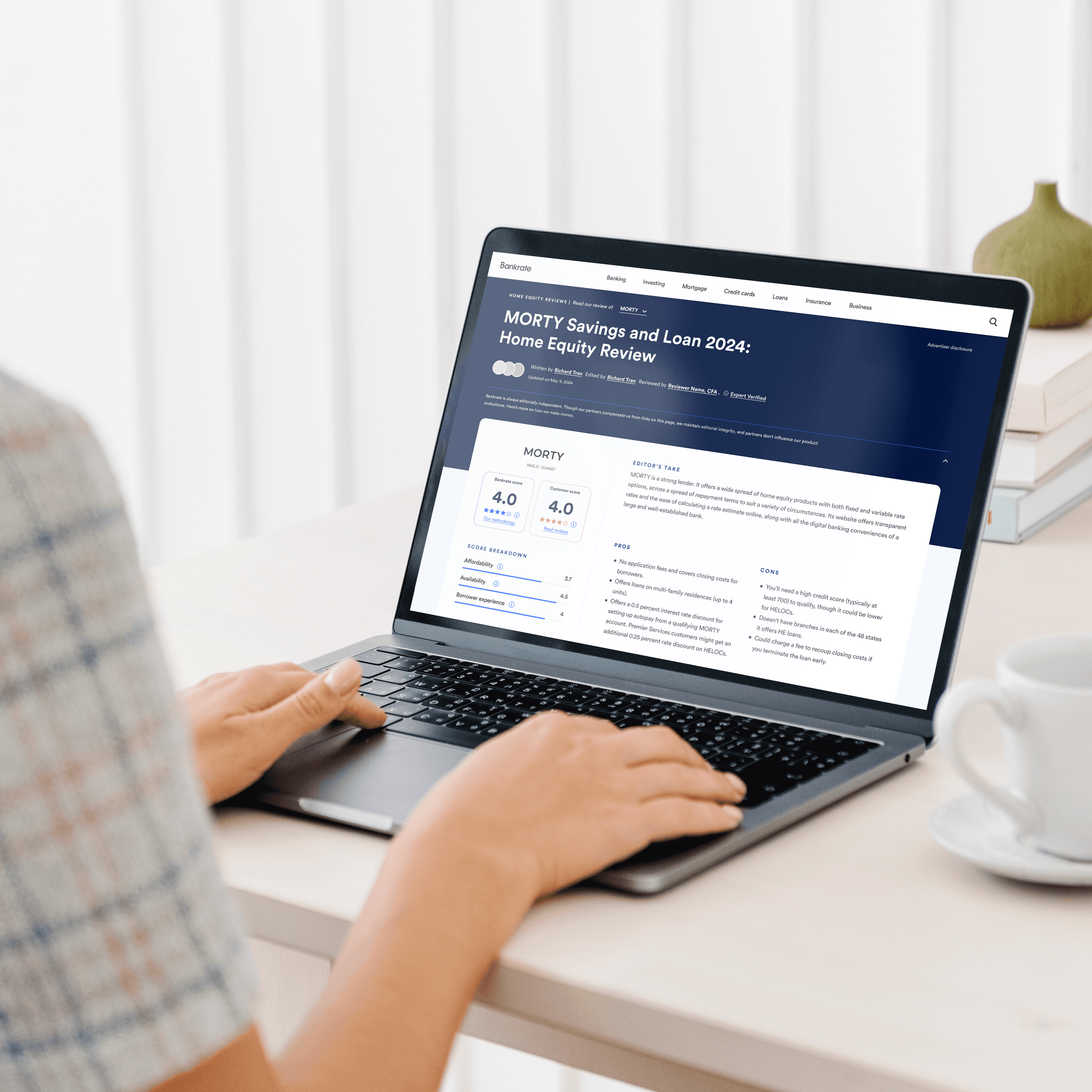
The biggest obstacle wasn't layout — it was a single component that stakeholders and SEO requirements insisted on keeping above the fold: an advertisement widget. Bold background, prominent CTA, supporting copy. Three elements competing for attention at the exact moment users needed clarity most.
I didn't just argue against it. I designed around it — repeatedly. Version after version showed the team what it looked like to force the widget into the "At a Glance" card. Each iteration made the same thing visible: significant effort spent on something that was actively resisting the goal. The iterations became the argument. Stakeholders agreed, and the advertisement was removed from above the fold — a real cost to a business touchpoint, resolved through design evidence rather than opinion.
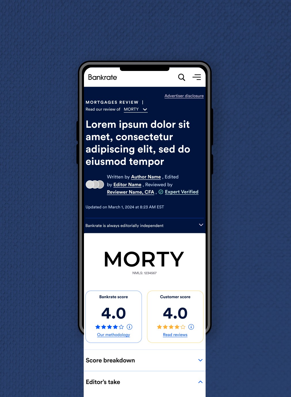
The final layout is clean and intentionally simple. The left side carries scoring and value signals — Bankrate score, customer score, category breakdown. The right carries editorial context — Editor's Take, pros, cons. Two clear zones. Eye movement traces naturally from quantitative judgment to qualitative context without friction.
The systems work followed the same logic: identify a structural foundation flexible enough to serve different verticals without requiring each one to redesign from scratch. I iterated through multiple variations, templatized the direction, and handed a proven concept to a senior designer who took it to completion.
Results
The design sparked the initiative to be cohesive across the Bankrate brand to reduce the cognitive overload. Verticals began testing various ways to implement our new design approach to be optimize amongst their own experiences.


ROLE
ASSOCIATE PRODUCT DESIGNER
COMPANY
BANKRATE
TOOL
FIGMA